- Branding & Graphic Design
- Print Design
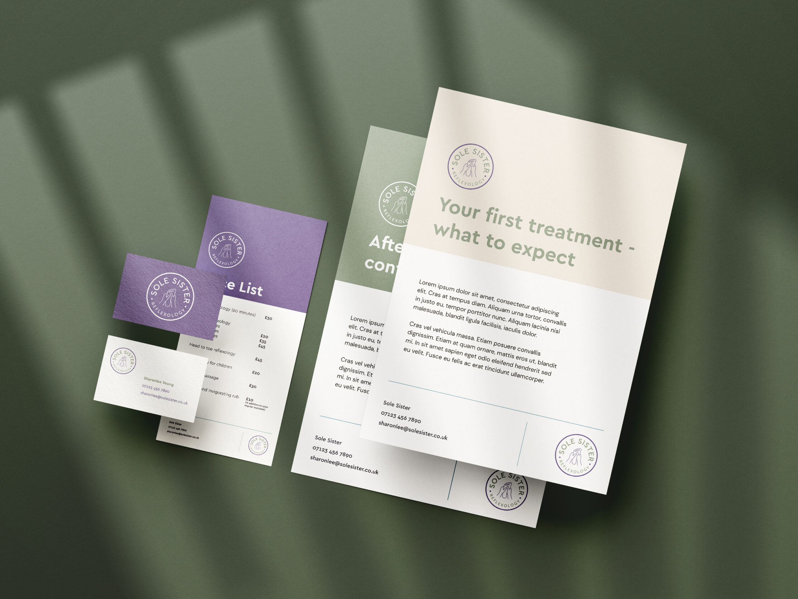
Project Brief
The client wanted a soft, fresh branding look which was modern to advertise her new reflexology business. I presented several options with different colours, typefaces and iconography, and tweaked the chosen design until they were happy.
Project Outcome
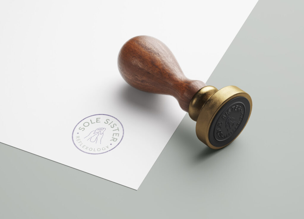
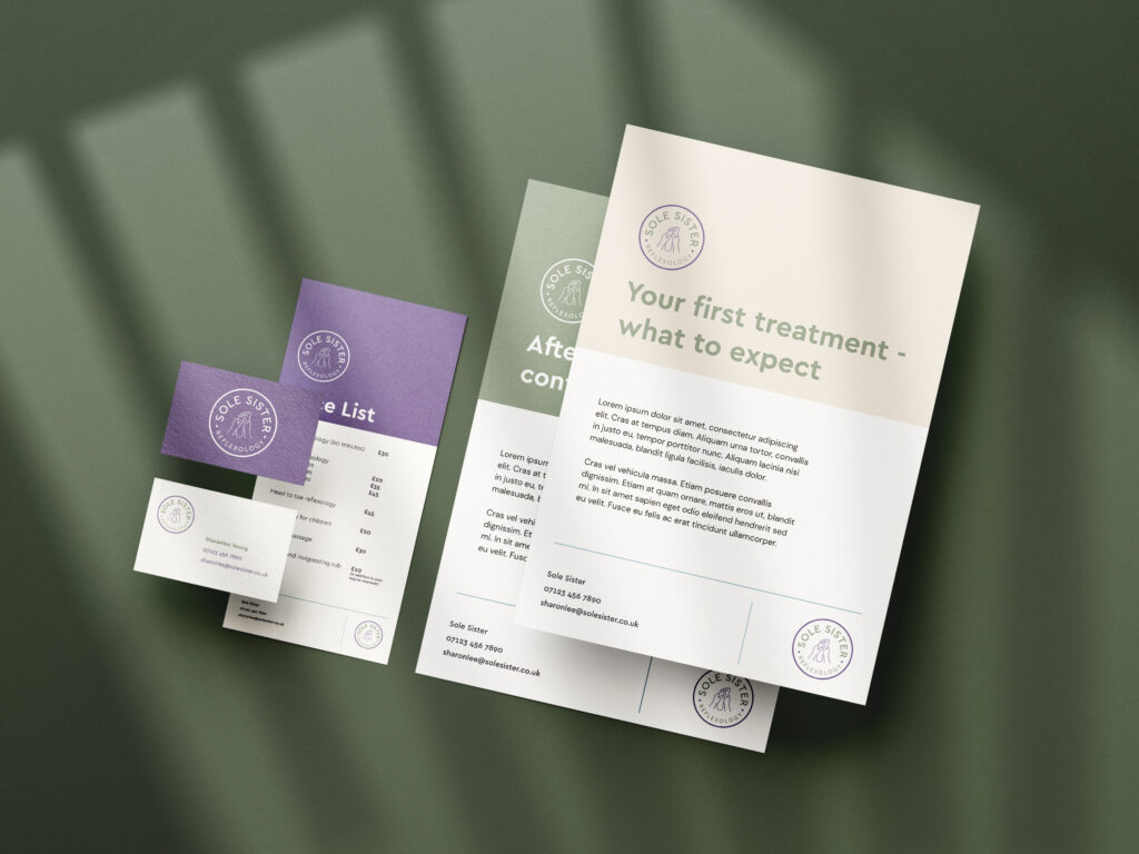
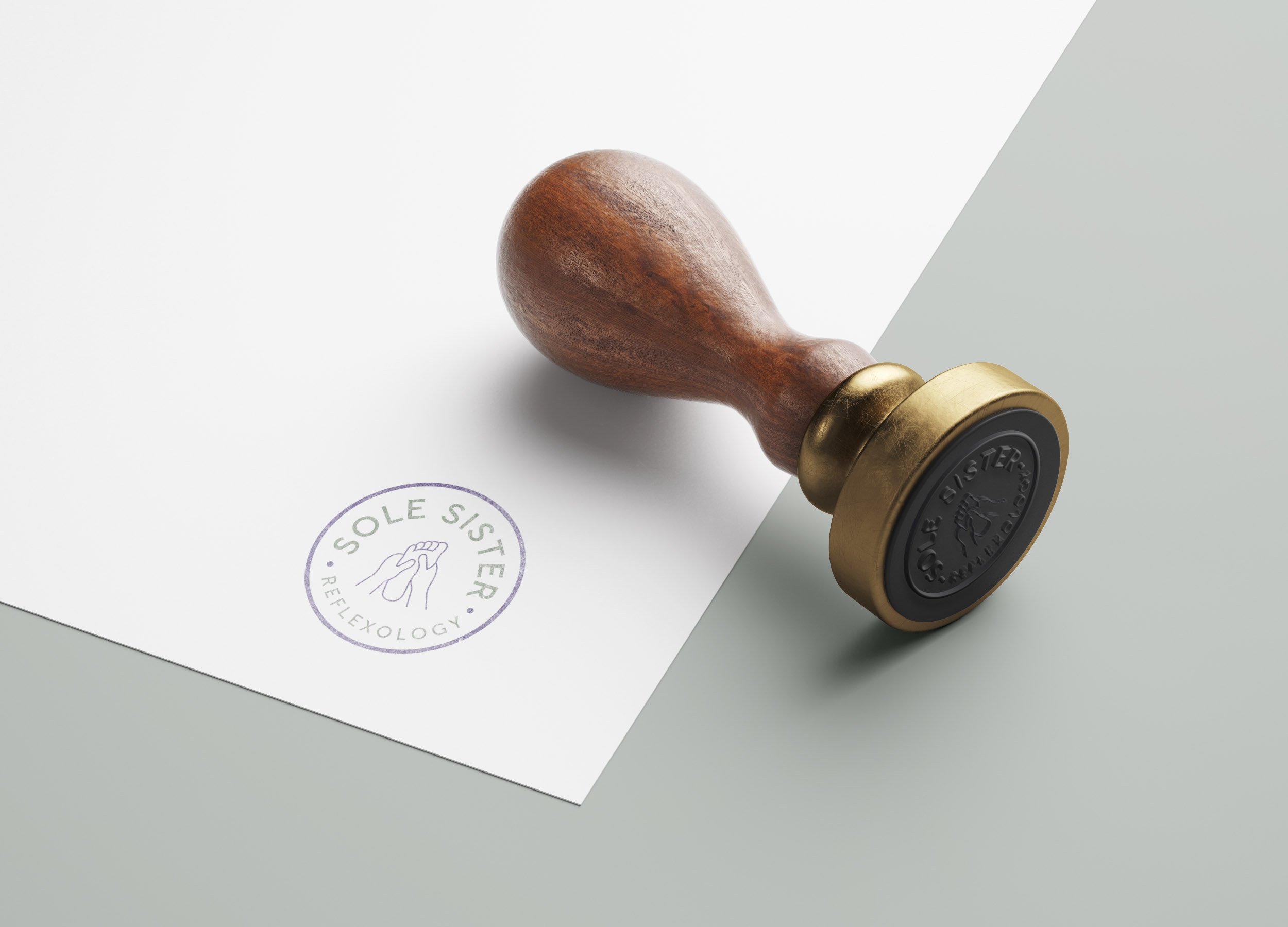
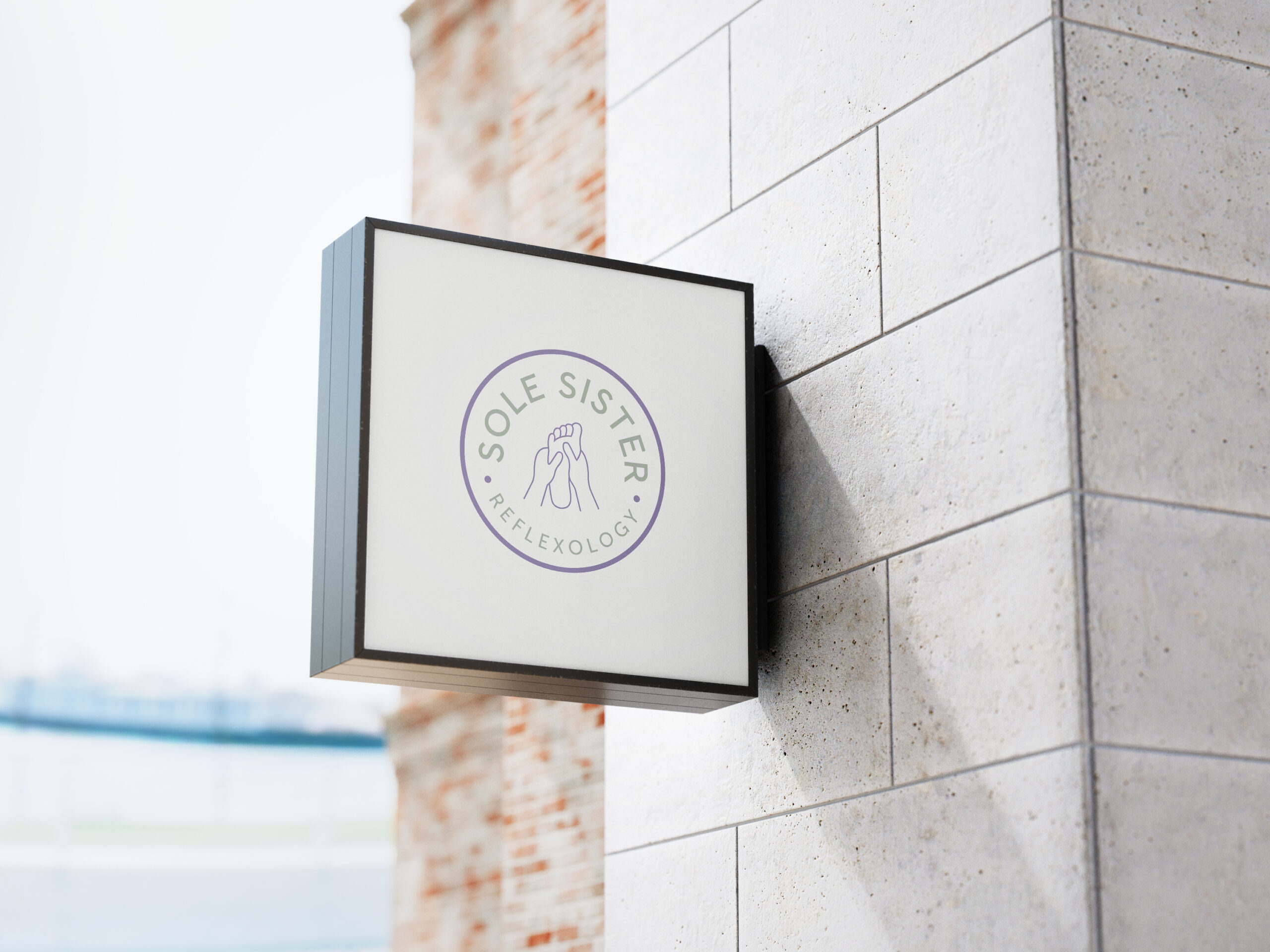
The final design uses a roundel stamp design which is easily applied across a range of media, along with a soft, muted colour palette to complement the business’s approach.
I commissioned Rachel to design a logo for my new complementary therapy business. I gave her a description of the services I provide, examples of a couple of logos I liked and how I hoped I would be able to help my clients. Rachel developed five very different designs for me together with a description and or rationale for the design and colour options. They were all fantastic which made it incredibly difficult to choose the final design!
Rachel was very professional throughout and worked to the timescales we agreed together. I am delighted with my logo and will return to Rachel in the future.
Sharonlee YoungSole Sister Reflexology
